Chart go up
Introduction
There’s a certain type of discussion about politics and economics that goes like this. Person 1 makes a non-quantitative claim. Democrats would be better off nominating people more principled than centrists/moderates. I’m masking in public because I’m still worried about Covid. There has been a generational stagnation in purchasing power.
Person 2 responds with a statistic or a chart. You’re wrong because of the numbers, they say.
Actually, ”Moderate Democratic candidates enjoyed a nearly four-point advantage in vote margin over progressive candidates…The average WAR of the 20 Blue Dogs-endorsed candidates was +4.5, which was nearly nine points better than the average WAR of the nine progressive candidates endorsed by the Justice Democrats” (Lakshya Jain)
Actually, “with the massive decrease in death rates, Covid is now no more dangerous than the flu for those who catch it. Epidemiological data showed the same thing in the UK back in the spring.” (Noah Smith)
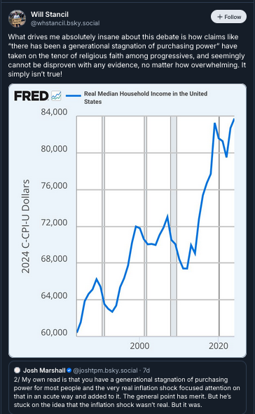
Actually (Will Stancil),

I am not against numbers. In fact, I spend most of my working hours dealing with them! Sometimes numbers are genuinely illuminating, and can represent a lighthouse in a fog of anecdotes.
What bothers me is when numbers and charts are presented as the end of a debate, as opposed to the start of one. It is rare, in my experience, for a statistic or a metric to fully refute a claim. It’s worth examining the reasons why.
The most obvious reason is that non-quantitative claims, like the ones presented above, are usually value-laden. No one should dispute that Covid deaths have fallen dramatically since the peak of the pandemic. That’s a quantitative claim about a relatively straightforward metric. But whether Covid risk is sufficiently low to declare victory, or to abandon preventative measures (like masking), is an entirely different type of claim. Evaluating it requires understanding a lot about the claimant: their risk tolerance, their daily activities, their circle of friends and family, and so on. We have to understand someone’s values to know whether they are being irrational about Covid risk. (And rarely do we know anything about our interlocutors on social media.) Presenting a bunch of epidemiological aggregates isn’t good enough.
The other important reason that charts might lead us astray is that metrics are rarely so straightforward as “deaths”. This is where data science and quantitative methodology can be genuinely useful — not so much in building charts, but in helping to understand what they really mean. There is a “third way” that’s better than either of the first two ways. We don’t have to be numerically illiterate or reactionary against quantitative information, like so many on social media. Yet neither do we have to be the kind of supercilious asshole who thinks that a chart represents a knockout blow (like so many others on social media). Instead of anecdotes, on the one hand, or scientism, on the other, we can do (data) science.
(There is also a separate set of concerns about quantitative claims, relating to “significance” and “uncertainty”. I discussed those in a previous blog post.)
STEDII as she goes

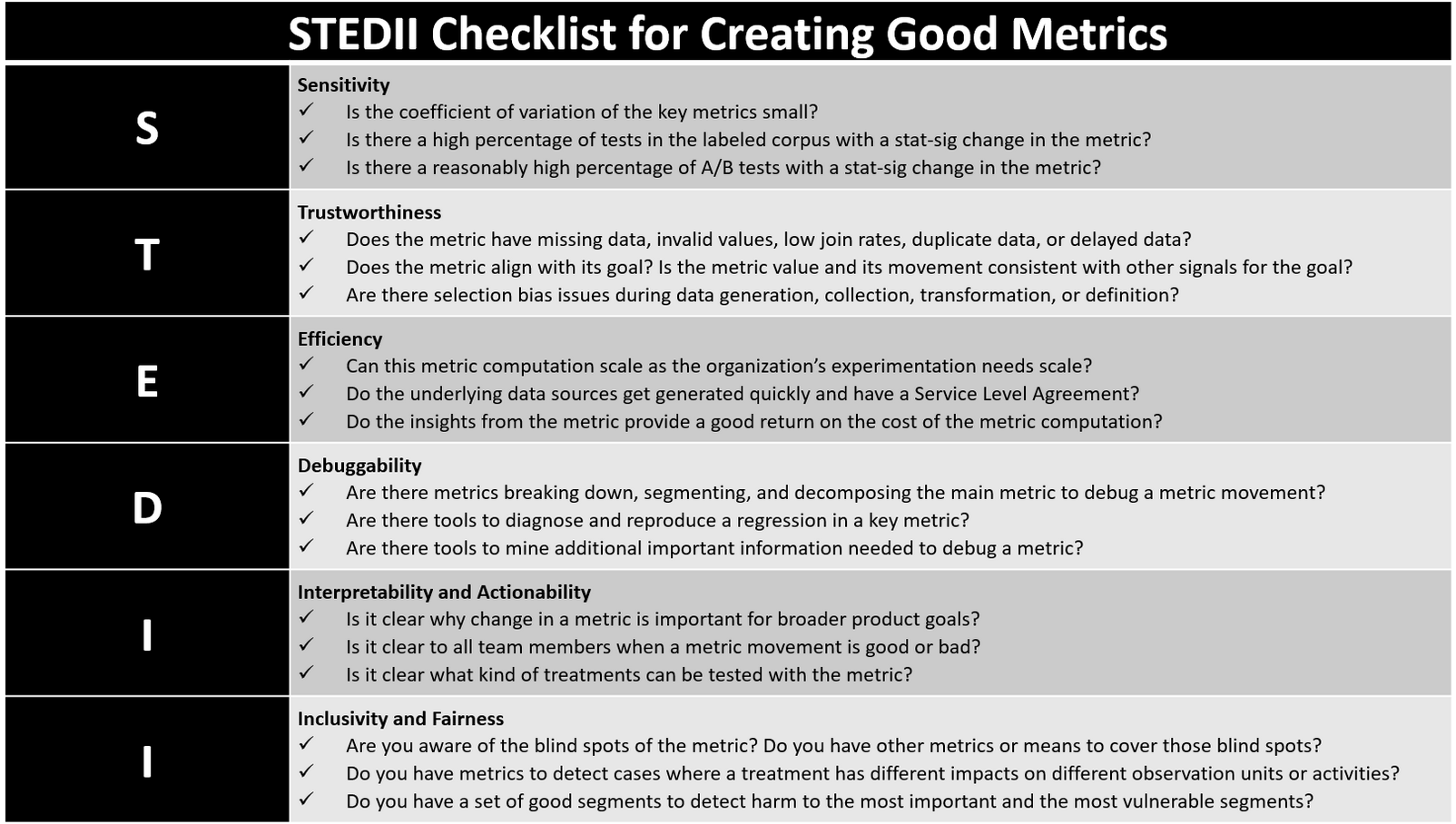
Microsoft presented a neat framework, called STEDII, to evaluate the properties of a (experiment) metric. (See above.) Put differently, STEDII is a framework for “metrics critique”. What are the ways in which a metric might go awry? Let’s try applying these lessons to the aforementioned claims about “moderate Democrats WAR” and “real median household income”
Some aspects of the STEDII framework are tech-specific. For example, we rarely have to worry about the “debuggability” of metrics related to economics and politics, or at least we can leave such issues to the diligent researchers at BLS and other places. But other parts of the framework are more widely applicable. I want to focus on a few.
One is trustworthiness. “Does a metric align with its goal?” and “Are there selection bias issues during data generation, collection, transformation, or definition?” Another is “inclusivity and fairness”. Can you “detect harm to the most important and most vulnerable segments?”
A case study
What’s interesting is that Will Stancil's claims, in my first example, run into problems in each of these areas! I’ll leave the heavy lifting to Steve Waldman at interfluidity, and have quoted him at length below.
First, there are the trustworthiness issues. Stancil claims that “real median household income” is a trustworthy metric for measuring the ultimate “goal”, which is “purchasing power”. In short, he assumes that one is a very good proxy for the other. Yet Waldman shows that this isn’t really true over long periods of time.
The quantity of transportation our modern commuter purchases with his transportation budget, in terms of miles traveled, is extraordinary, even miraculous, from his antecedent's perspective. Less than ten percent of his wages now purchase miles and miles of point-to-point, off-street-line transportation, which might easily have consumed his entire salary in 1925!
So, in a certain sense, our modern commuter is a whole lot richer. Economic statisticians accurately measure his real consumption bundle as much, much larger than his predecessor's due to the collapse in cost, increase in speed and comfort, of transportation.
But in another respect, our modern commuter is not richer at all. The world has changed. He no longer has the option of taking a job whose quality and pay would support his typical commuter lifestyle absent accepting an obligation to purchase all of those transportation miles.
To simplify a bit, “real median household income” measures, in part, your ability to buy transportation services. But it does not account for how getting to work, or living your life, has become more time-consuming. The metric differs from its goal, and our ignorance of this fact has blinded us to the ways in which we’ve become poorer, not richer.
(There’s also the issue that real median household income does not include welfare transfers or household wealth — it measures how much you earn, not how much you have to spend.)
Another aspect of trustworthiness is “selection bias in data generation, collection, transformation, and definition”. Both “inflation” and “median household income” (which is derived from inflation) suffer from such biases:
When constructing measures of the price level, if we fail to take into account adjustments in quality, we'll get things very wrong. BLS does adjust for quality! But they can only do so for characteristics that can be straightforwardly quantified, and their relationship to price modeled. Plus, there are lots of characteristics that plainly affect the quality of our consumption of a good or service that would, for a variety of reasons, be controversial to incorporate into a price measure, and so aren't.
Suppose we faced a new national crime wave that led to a broad-based increase in ones risk of getting mugged or ones house burgled. The risk level has increased similarly basically everywhere. For all of us, then, the value in real terms of our housing will have declined. Nearby crime is definitely a component of the lived quality of housing!
The “selection bias” here lies in what components of quality are measurable. The inflation index adjusts for measurable aspects of quality, like home size/number of rooms. But it doesn’t for other aspects of quality, like crime, or proximity to friends, or commute time. If these factors change secularly over long periods of time (like the crime rate has), then the measure will steadily drift away from its corresponding goal.
Finally, there is the “inclusivity and fairness” problem with metrics — not just how the number has moved, but how it has moved for different units or “segments”. A serious problem with Stancil’s chart is that it ignores these distributional issues.
The less rich spend a greater much fraction of their wealth on necessities and inferior goods than the wealthy do. A quick glance at the graph above confirms that prices have tended to increase quickly for the necessities that consume a large share of the median consumer's budget, while we've enjoyed outright deflation in more discretionary goods. So "median household real income" is overstated for the median consumer, because its very units are biased toward the experience of the better off.
This bias would disappear if variability in the rate of price changes happened to be orthogonal to differences in the consumption bundle between the rich and less rich, but that is unlikely ever to be the case. Independence of variables in social affairs is the rare exception, not the rule.
Closing
To recap: it isn’t enough to say “chart go up”. We need to know when the metric is depicts serves as a proxy for the ultimate goal, and when it doesn’t. We must be aware of omissions or biases in the data used to assemble it. We also need to understand the distributional implications: how has the metric changed for you, or me, or anyone else?
None of this is an excuse to throw our hands up and claim that data is useless. We really need to understand how purchasing power is changing, and the inflation index, despite its flaws, is better than nothing. Ideally, metrics critique leads to the development of better (albeit still imperfect) metrics, ones that try to address the criticisms levied at their naive counterparts. (To return to my second example, about the value of moderation, there probably is a much better version of the politician “WAR” metric that addresses the issues pointed out by Jake Grumbach, Adam Bonica, and G. Elliott Morris.)
I find it frustrating to witness the same debates, with the same kinds of elementary mistakes, playing out over and over again. I realize most people on Twitter and Bluesky will never read about the STEDII framework, or metrics critique. But they should.